

OUR CLIENT ASKED US TO
refine a telehealth platform to better serve doctors and patients alike
Health Direct Global is a Ghana-based health-tech startup aiming to provide timely, quality, and affordable healthcare. Our team was brought in to improve Carely—a doctor-facing web portal—and to design a new landing page targeting four key user groups: patients, doctors, healthcare administrators, and pharmacists.
TIMELINE
6 Weeks
TEAM
1 Project Manager
1 Research Lead
1 Assistant Designer
MY ROLE
UX Lead
TOOLS
Figma
Photoshop
UserTesting
BACKGROUND
Untangling Carely’s core functionality
The existing Carely platform—for doctors—posed challenges for doctors. The virtual appointment feature lacked intuitive navigation, leaving users confused about essential actions like pulling up a patient’s chart. Additionally, core doctor tools—such as referral management, prescription tracking, and revenue breakdown—were incomplete.
Our goal was to audit the platform, identify gaps, and design features that not only streamlined doctors’ workflows but also aligned with the platform’s broader mission to offer accessible care globally.

CLIENT STANDUPS
ROLE + TIMELINE
As Design Lead, I led the design strategy and execution—from facilitating design workshops and building out concepts to presenting polished flows to the client. I also created annotated files for dev handoff. I drove bi-weekly stand-ups with Health Direct Global’s CEO and other stakeholders.
In addition to design responsibilities, I collaborated with our Research Lead, Archana, to draft user interview questions and tasks for usability testing. I personally conducted interviews with a mental health consultant and a general surgeon, and captured notes during testing sessions to document user friction and confusion.
PROJECT TIMELINE
Week 1 – Research & Testing Current Platform
Week 2 – Ideation & User Journey Mapping
Week 3 – Design Sprints & Wireframing
Week 4 – Designing & Prototyping
Week 5 – Testing & Refining
Week 6 – Final Edits & Client Handoff
RESEARCH
COMPETITOR ANALYSIS
We began with a competitive analysis of leading telehealth platforms. This helped us identify usability patterns, interface standards, and standout features across the industry, providing a foundation to evaluate Carely’s current shortcomings and opportunities for innovation.
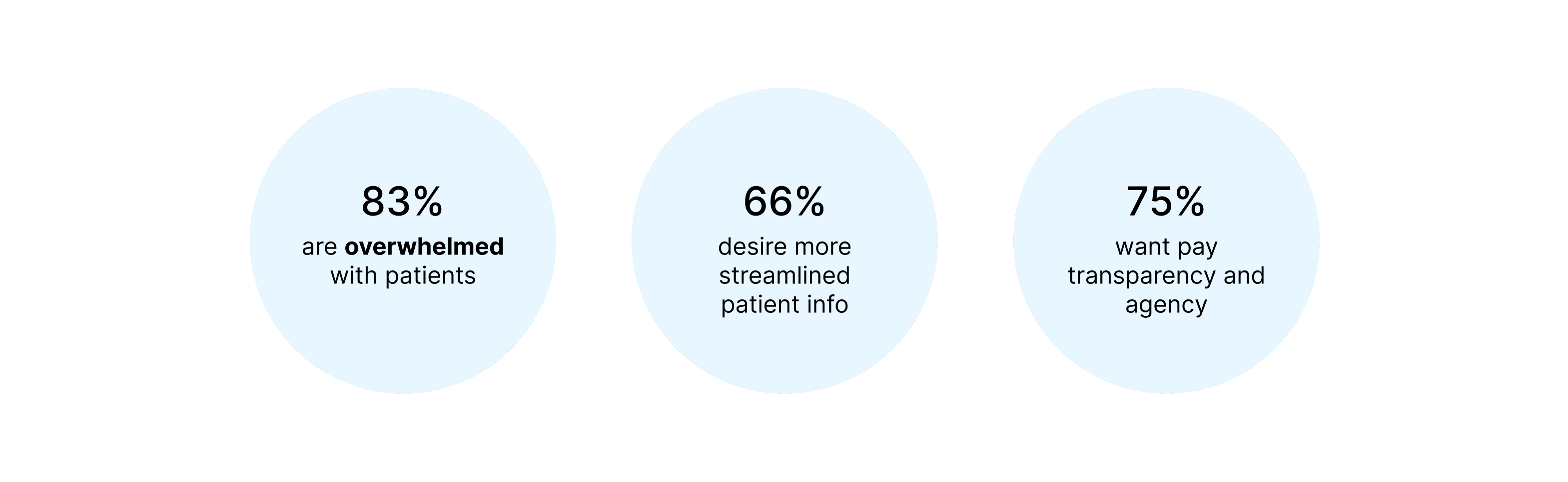
USER INTERVIEWS
Key findings
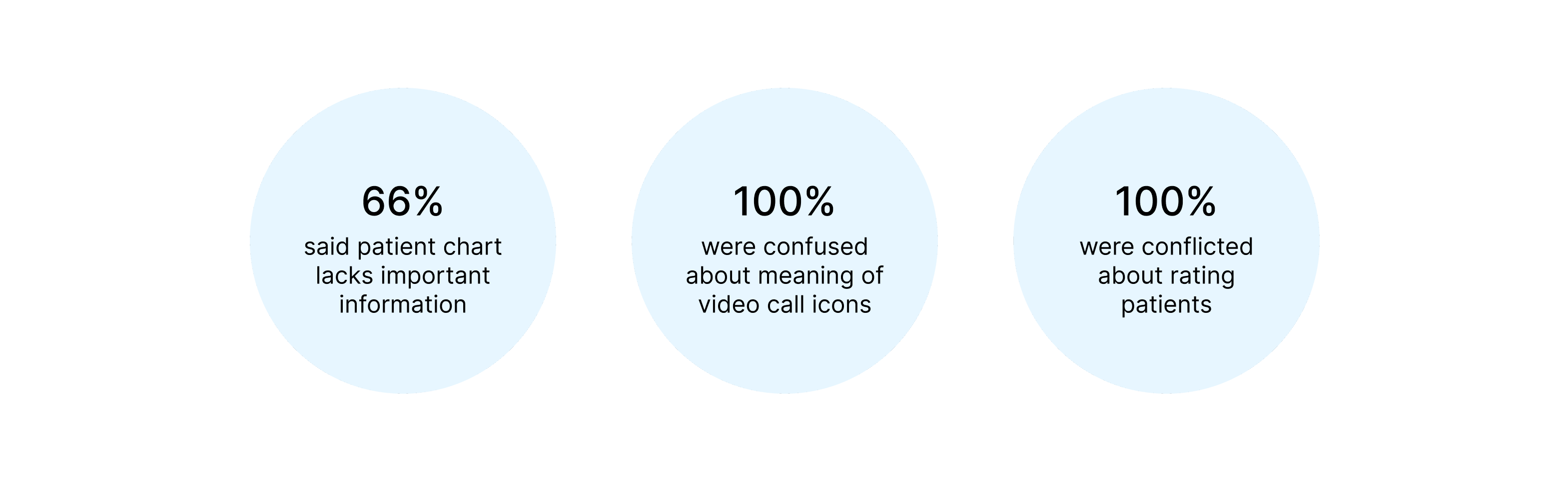
USABILITY TESTING
To understand where the platform fell short, we conducted usability tests on Carely’s existing prototype using Maze. We asked 3 healthcare workers to complete a set of common tasks within the doctor dashboard.
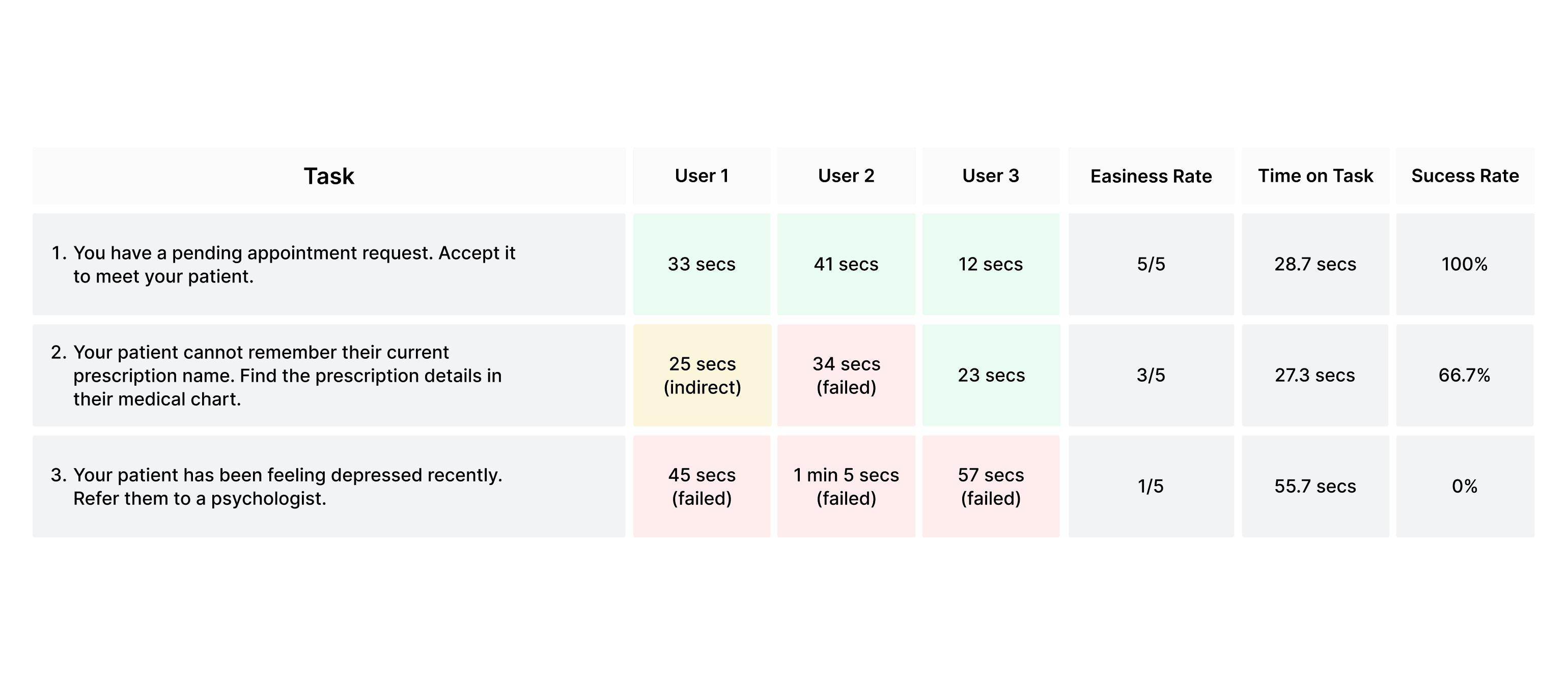
Key findings
IDEATION
AFFINITY MAPPING
Getting to know our user
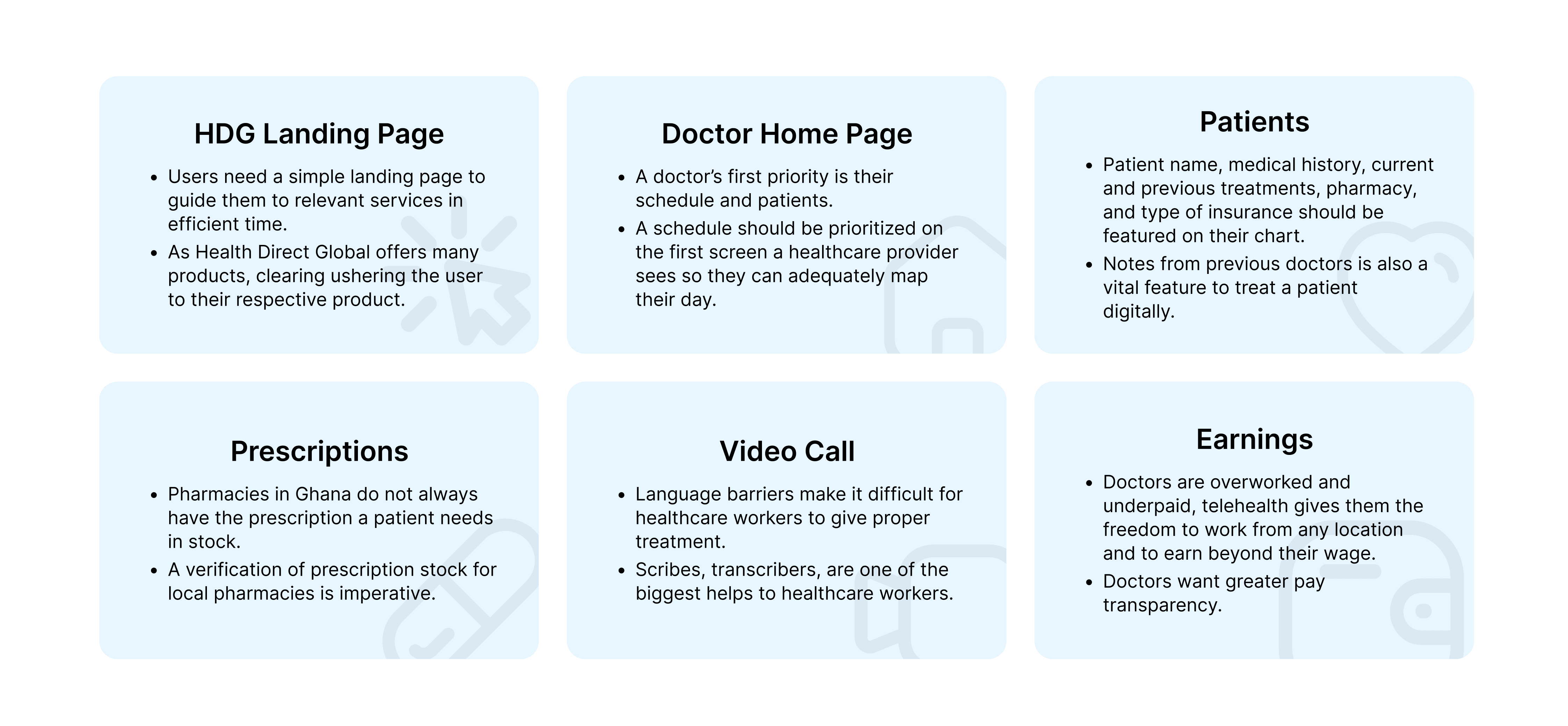
We synthesized our interview and usability testing data through affinity mapping to highlight key user needs and pain points. These insights shaped key features.
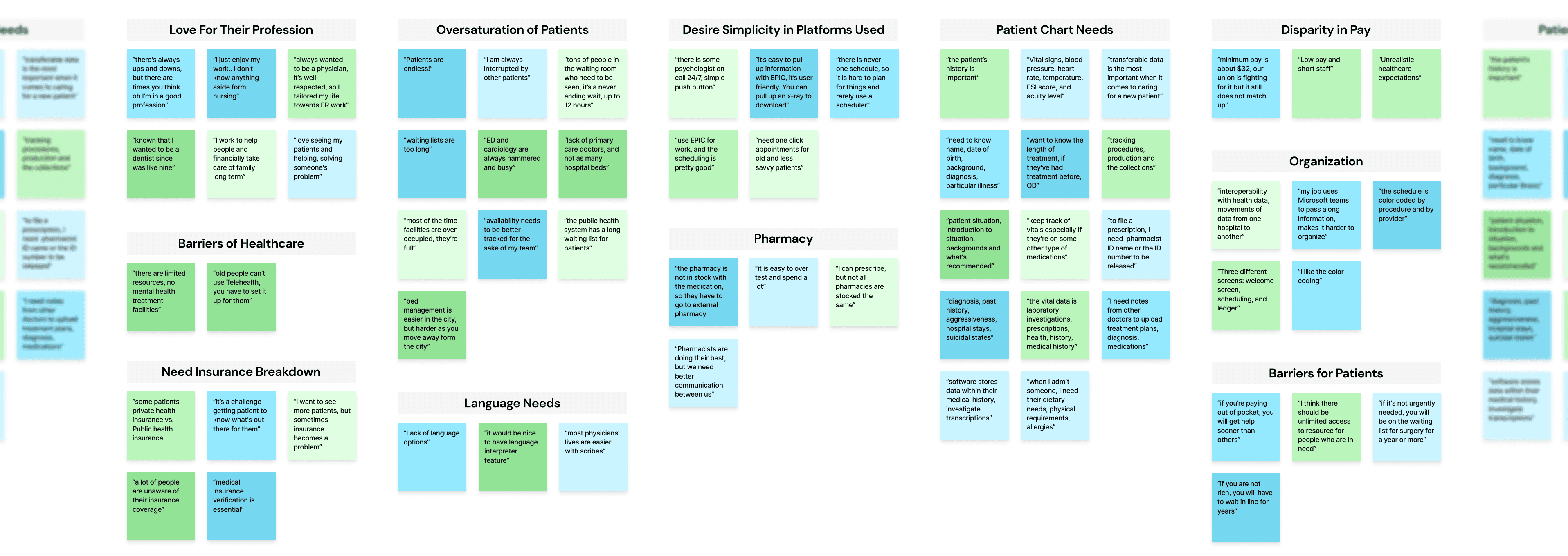
Guided by our research and client ask, we proposed a suite of essential features and refinements that would create a more intuitive, complete experience for doctors on Carely.
DESIGNING
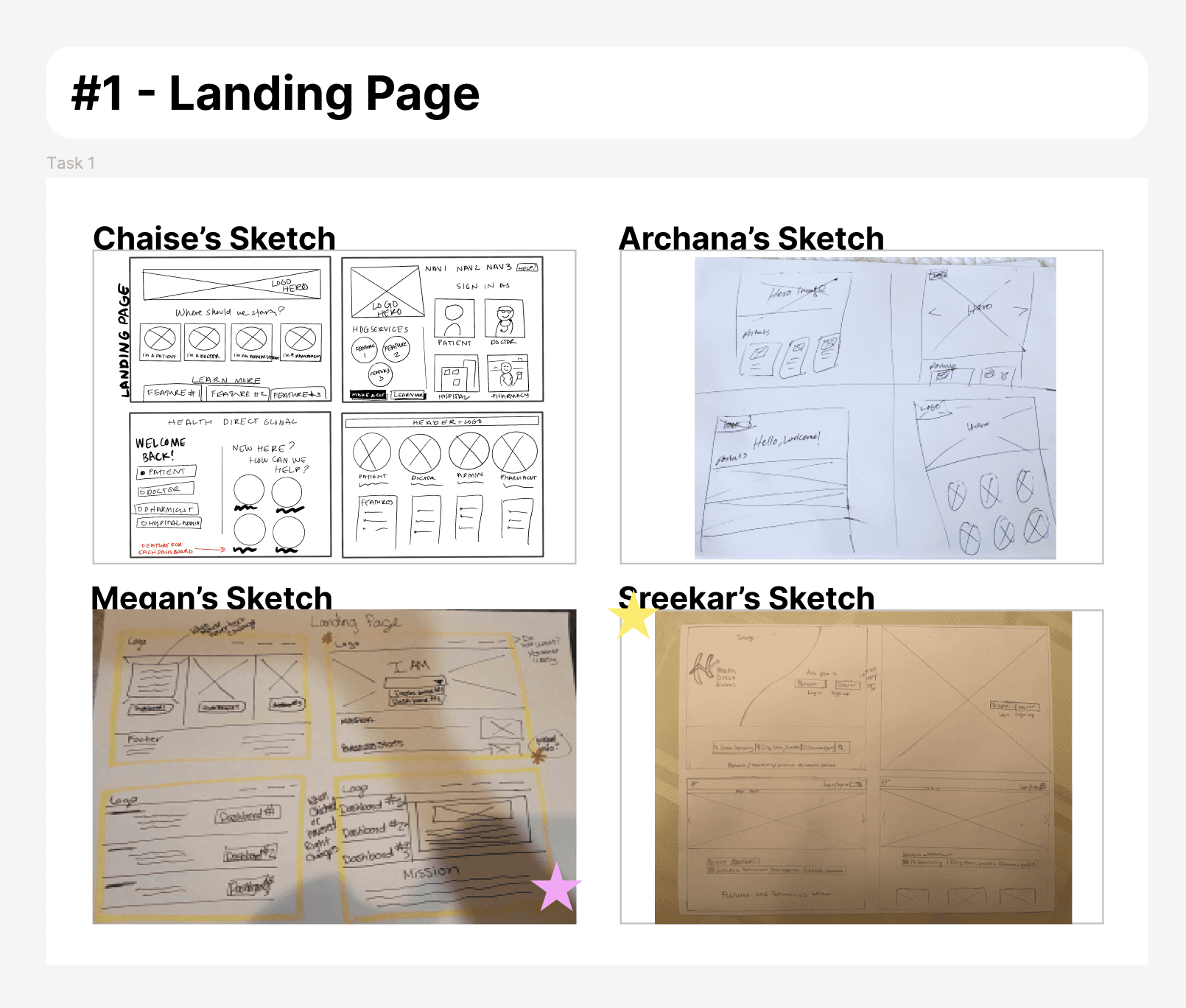
SKETCHING
As Design Lead, I facilitated two design workshops where our team explored solutions for both the dashboard and landing page.
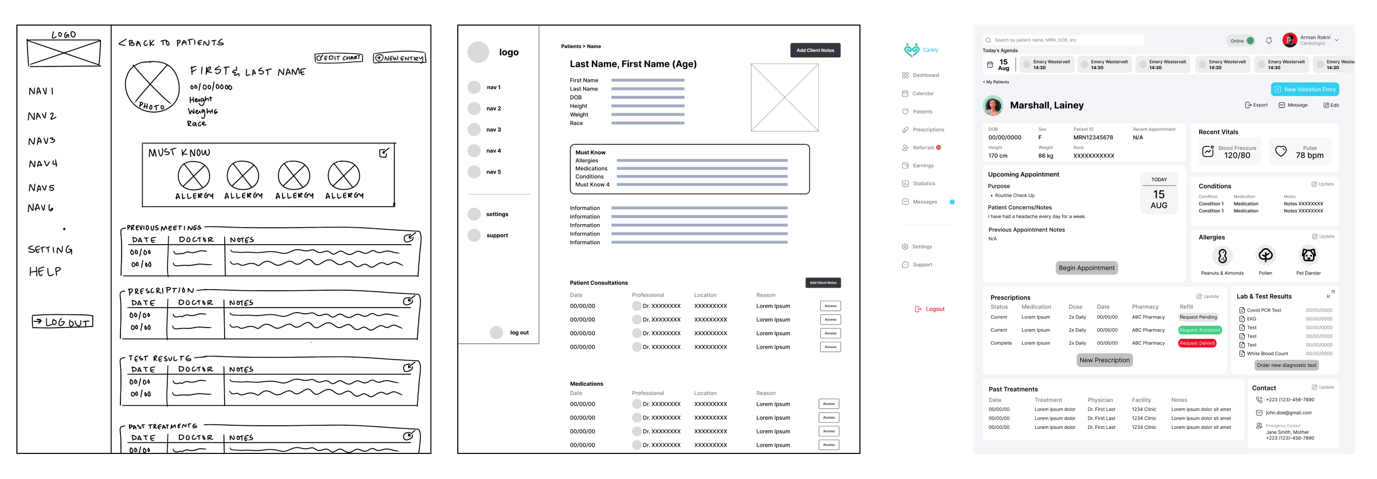
WIREFRAMING
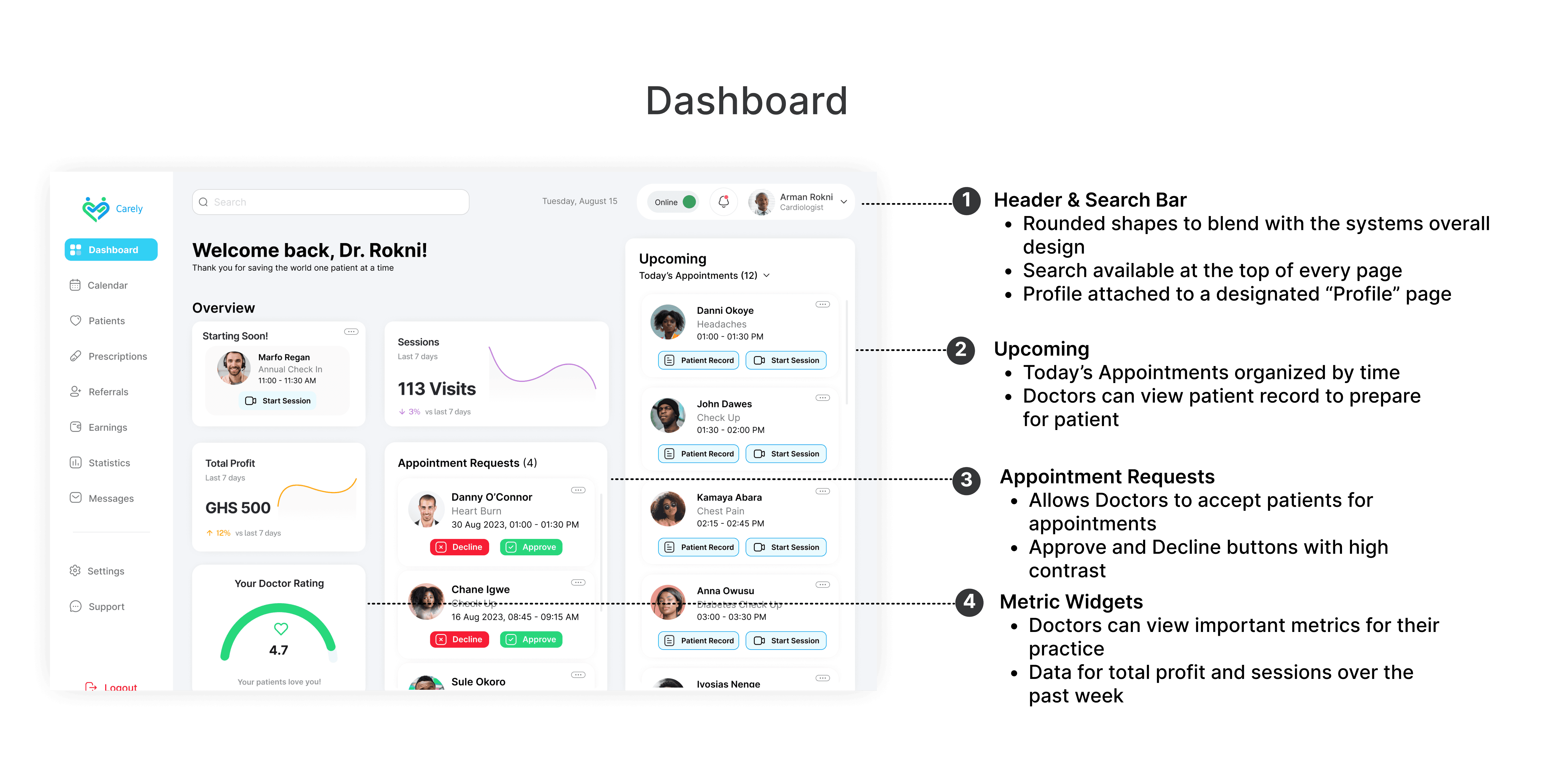
In the wireframing phase, we tested different layouts and feature groupings. Our goal was to surface high-priority information (like patient history and appointment schedules) while ensuring ease of navigation during high-stress scenarios like live consultations.
CHANGES TO CURRENT PROTOTYPE
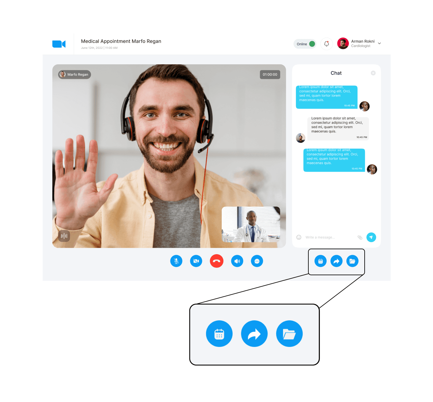
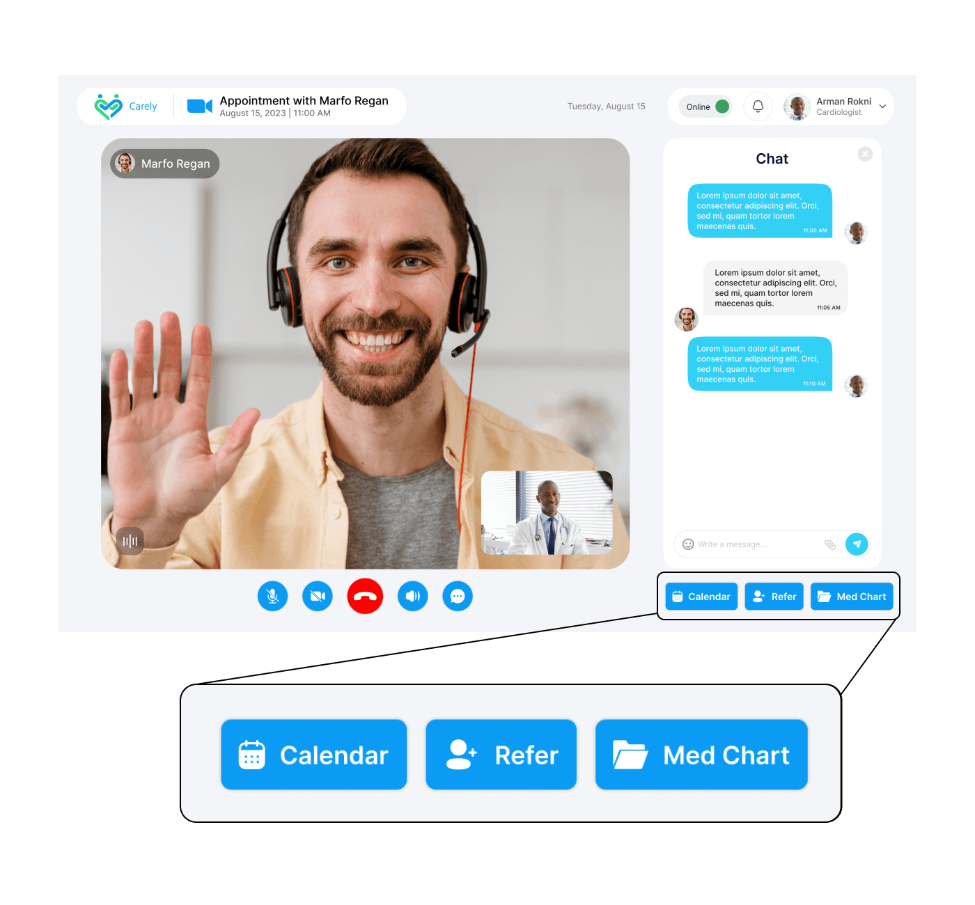
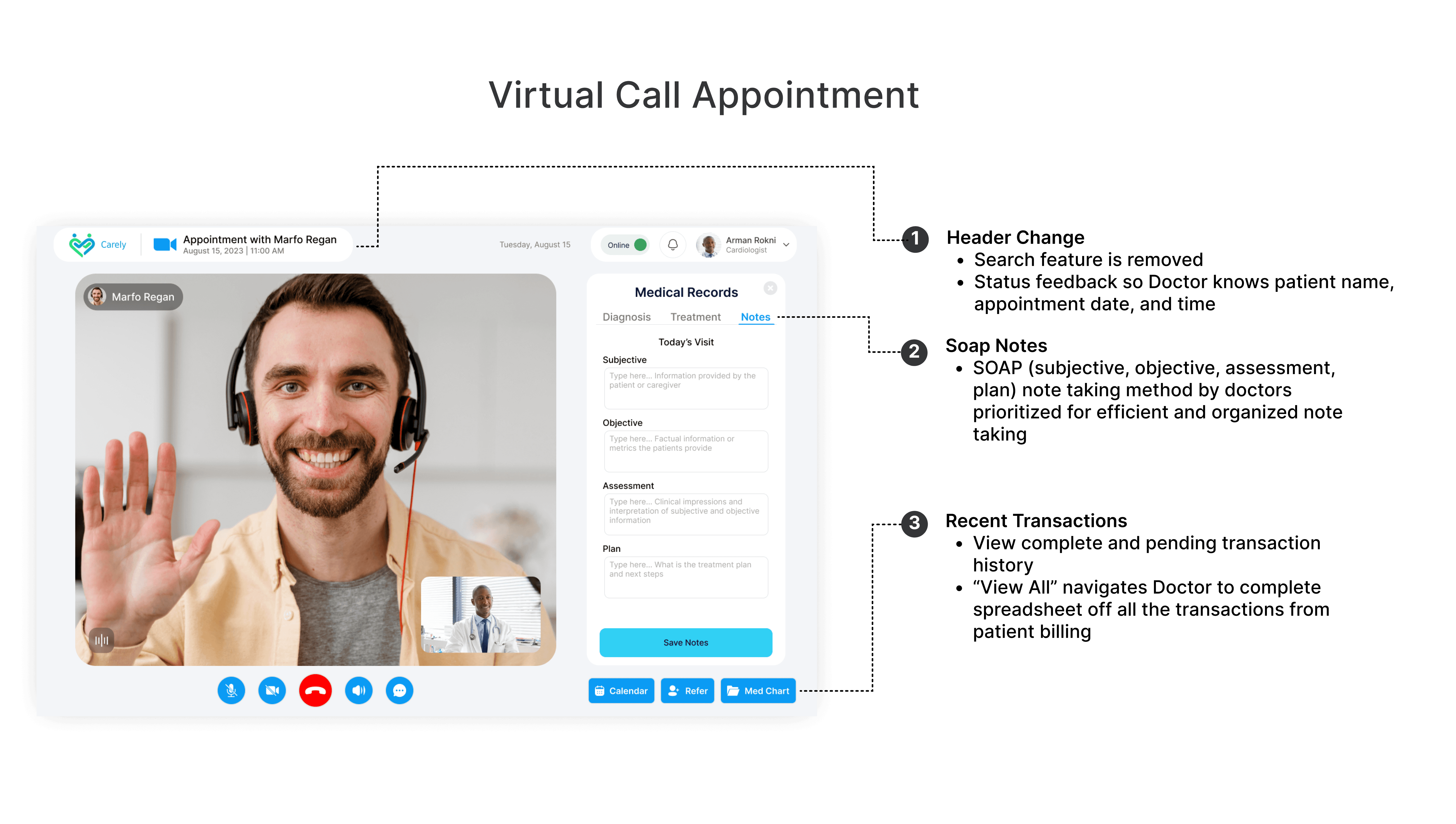
From our early usability tests, we learned that Carely’s call icons were ambiguous and confusing. In our redesign, we enlarged these icons, added descriptive labels, and restructured their placement for greater clarity and usability.
TESTING
USABILITY TESTING ROUND 2
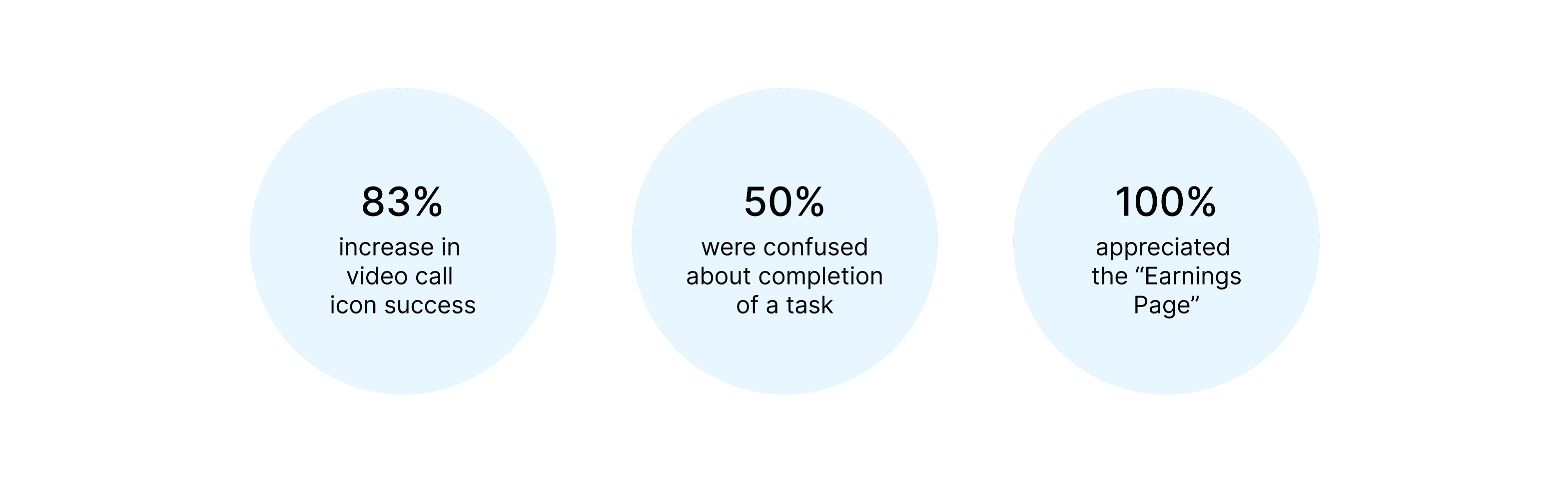
With a mid-fidelity prototype in hand, we conducted another round of usability testing—this time with 6 healthcare professionals. We asked participants to complete the same task set used in the first round to benchmark improvements and measure clarity.
FINAL DESIGNS
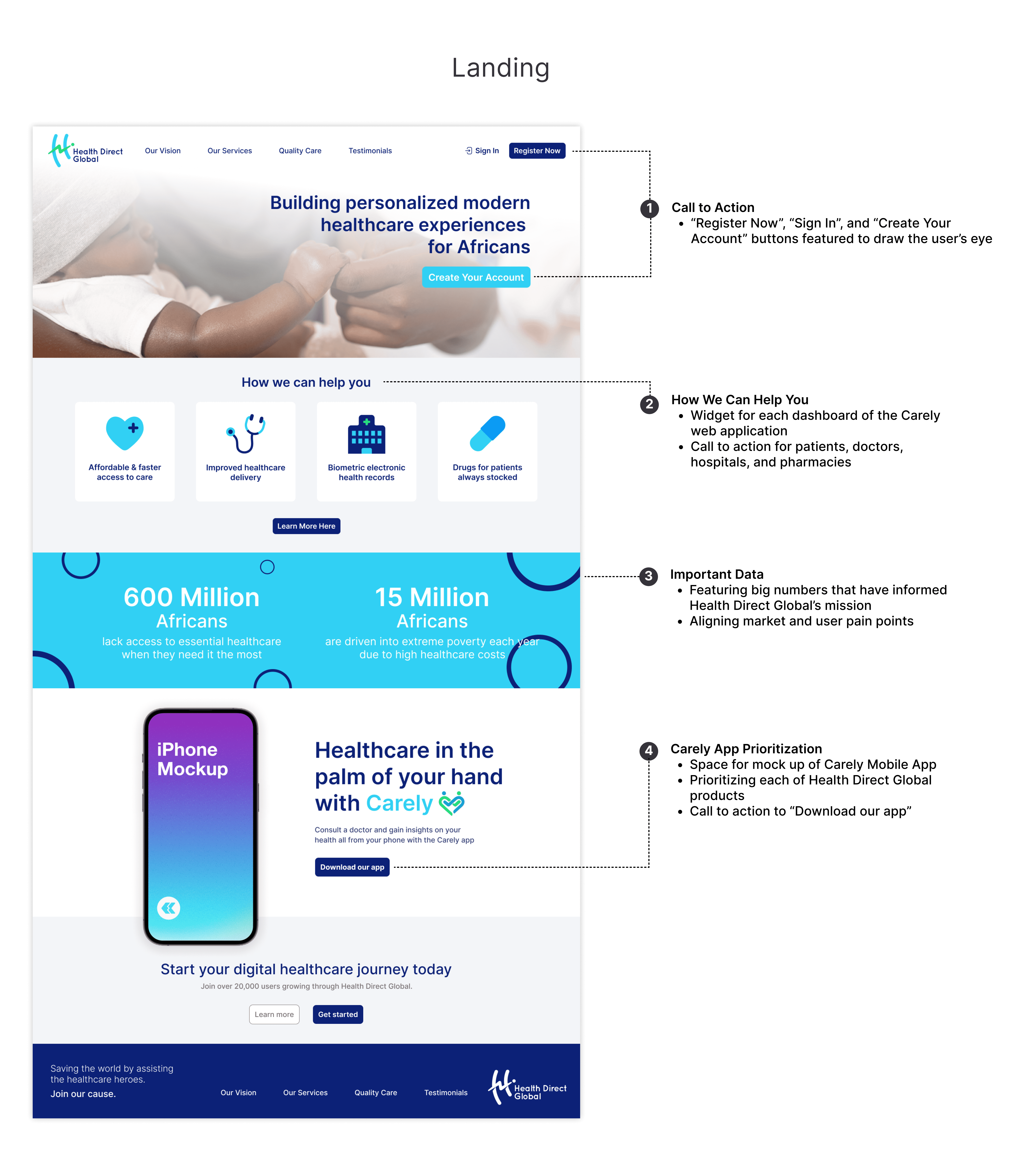
Health Direct Global Landing Page
Carely: Dashboard
Carely: Virtual Appointment Call
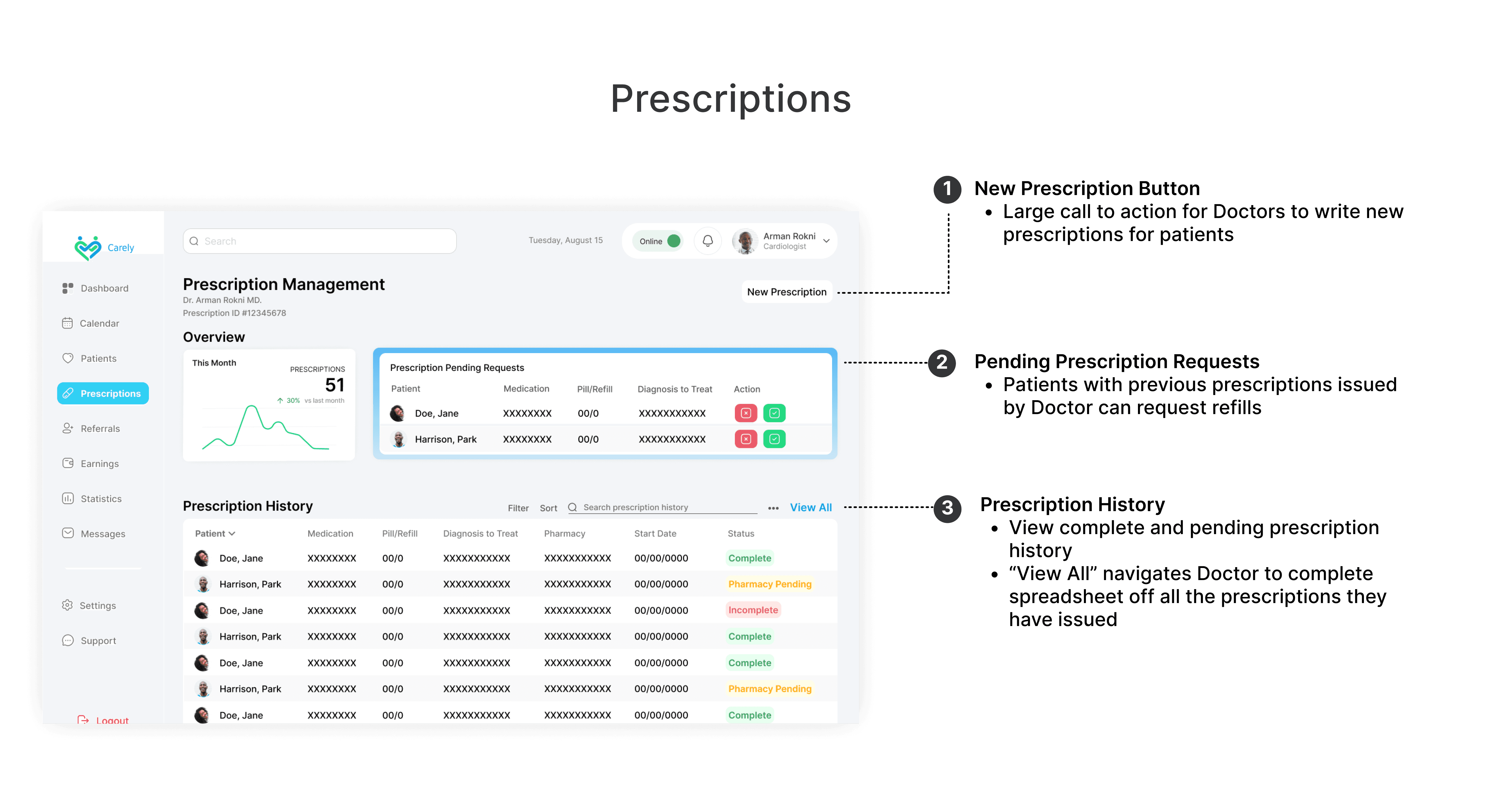
Carely: Prescriptions Management
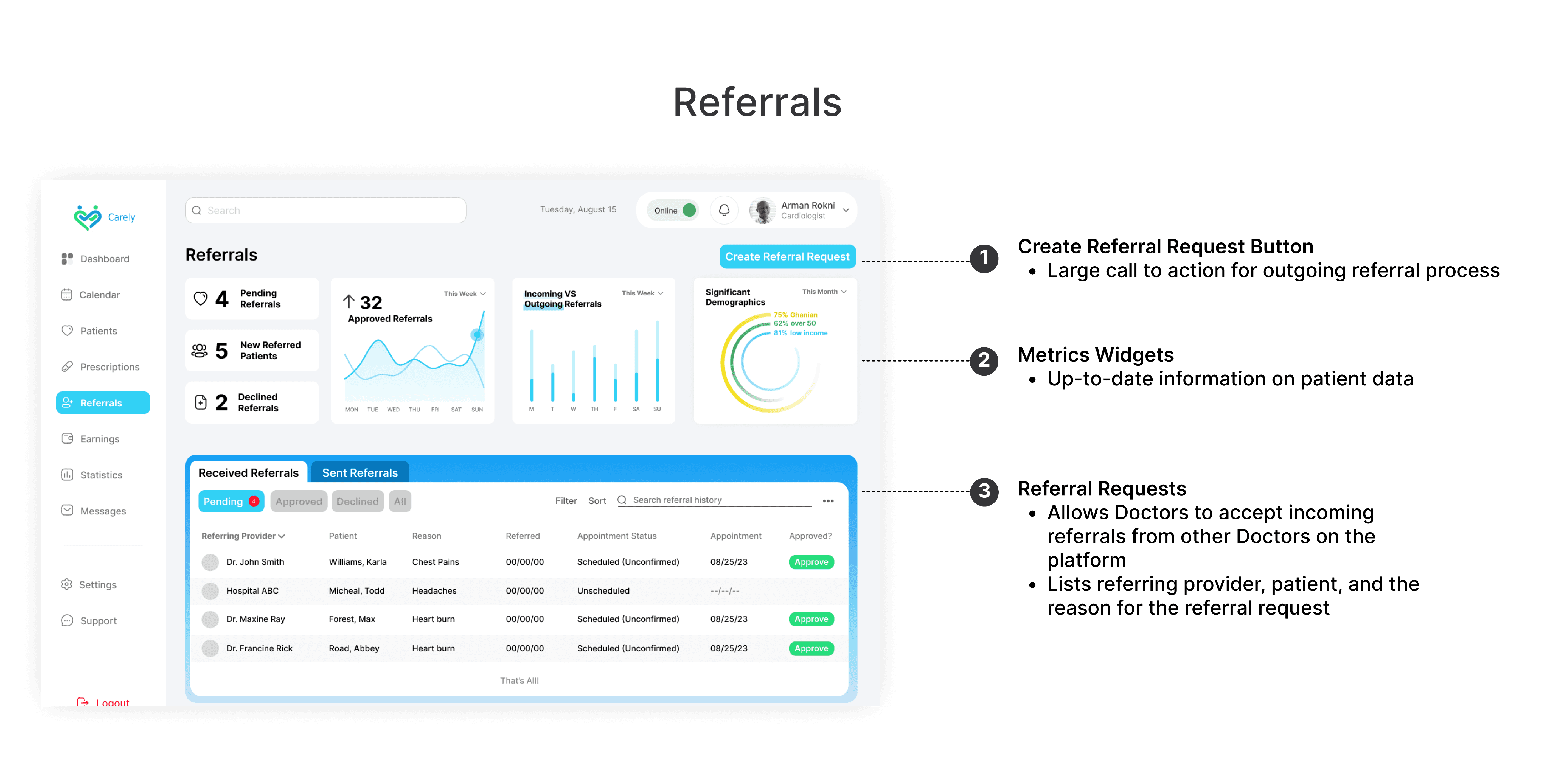
Carely: Referrals Management
REFLECTION
This was my first time leading a client-facing UX project. Weekly standups with HDG’s CEO, CFO, and developers taught me how to clearly advocate for design decisions grounded in research. I also gained confidence in facilitating workshops, translating user insights into product strategy, and preparing dev-ready documentation.
TAKEAWAYS
- Learned to prioritize UI clarity under real-world constraints
- Practiced testing early and iterating often
- Gained experience collaborating across time zones and disciplines
Is this love at first site?
Let's Connect
© Chaise Jones 2025